4. Complex layouts: Nested Views
1. RecyclerViews
See also: Android dev guide: create dynamic lists with RecyclerView.
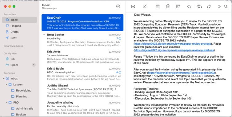
Now that we know what activities are, how to re-use components using fragments, and how to interact between these systems using intents, we almost know all the basics of Android app development. Remember the Mac Mail App layout, introduced in the fragment chapter?

The left-hand side displays a list users can select: their mails. The right-hand side shows the detail view of a single mail. We know these sections have to be divided into fragments to support big and small resolutions. But we do not yet know how to display a list of things. That’s where a RecyclerView comes in. From the Android docs:
RecyclerView makes it easy to efficiently display large sets of data. You supply the data and define how each item looks, and the RecyclerView library dynamically creates the elements when they’re needed.
As the name implies, RecyclerView recycles those individual elements. When an item scrolls off the screen, RecyclerView doesn’t destroy its view. Instead, RecyclerView reuses the view for new items that have scrolled onscreen. This reuse vastly improves performance, improving your app’s responsiveness and reducing power consumption.
This means we’ll design how a single item looks like, supply the data, and the RecyclerView will duplicate these and fill in all the details such as (infinite) scroll handling. We’ll need a couple of things to do that:
- A
RecyclerViewinstance, that is just like any other view, a part of your layout. - A
ViewHolderthat represents an individual object, and gets binded to the RecyclerView’s data. - An
Adapterthat defines and associates with the data with the ViewHolder.
The recycler view is included via the androidx.recyclerview:recyclerview:1.2.1 dependency.
Let’s try to make a simple TODO app to show how these three things are intertwined.

1. Design your layouts
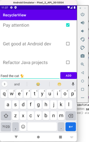
In your activity XML file, we will add three objects: a RecyclerView, which will represent the list, an EditText view and a Button, which can be used to add new TODO items to the list. Remember their IDs. The recyclerview might look like this (constraints omitted for brevity):
<androidx.recyclerview.widget.RecyclerView
    android:id="@+id/rvwTodo"
    android:layout_width="match_parent"
    android:layout_height="0dp" />
Besides the activity_main.xml file, we’ll need a second XML file to design the layout of a single item in the list. This will get repeated and/or recycled by the RecyclerView class. All we need to do is to add a TextView and a Checkbox—just like in the screenshot above. The root layout can be a ConstraintLayout, just like any other activity.
Give the root a android:layout_height value of only 100dp, otherwise every item will be the size of the entire screen. If only a single item appears in your recyclerview, you likely have made a layout mistake—double-check your width, height, and constrained properties in the XML files.
For recent versions of androidx.core, it is not necessary to add a separate dependency for the recyler view components. However, for version 1.6 and older, you will need to add the Gradle dependency androidx.recyclerview:recyclerview:1.2.1.
2. Create your model and adapter
Next, we’ll create a class that extends from RecyclerView.Adapter, and an inner class that represents the view holder. These classes drive our recycler view: they (1) couple the layout XML onto the view, and (2) manage the creation of new holders and binding.
Three methods have to be overrided: item counting (easy, just redirect to the list size), view holder binding (pry out an item and set view values accordingly), and lastly the creation of the viewholder:
class TodoAdapter(val items: List<Todo>) : RecyclerView.Adapter<TodoAdapter.TodoViewHolder>() {

    inner class TodoViewHolder(currentItemView: View) : RecyclerView.ViewHolder(currentItemView)

    override fun onCreateViewHolder(parent: ViewGroup, viewType: Int): TodoViewHolder {
        val view = LayoutInflater.from(parent.context).inflate(R.layout.item_todo, parent, false)
        return TodoViewHolder(view)
    }

    override fun onBindViewHolder(holder: TodoViewHolder, position: Int) {
        val currentTodoItem = items[position]
        holder.itemView.apply {
            findViewById<TextView>(R.id.txtTodoTitle).text = currentTodoItem.title
            findViewById<CheckBox>(R.id.chkTodoDone).isChecked = currentTodoItem.isDone
        }
    }

    override fun getItemCount(): Int = items.size
}
It is common practice to include an “inner class”—just like you would in Java—as a ViewHolder: the above definition does not have a body. You can move some of the bind logic there or provide custom onClick events for the checkboxes.
The model, the Todo class, is very simple, holding only a string and a boolean:
data class Todo(val title: String, val isDone: Boolean)
Note that this means the list the RecyclerView shows is a List<Todo>: it’s not list of primitives—although it can be: it can be anything! The official Android RecyclerView example on GitHub is a “flower finder” app and shows a list of thumbnails and descriptions.
3. Initialize your adapter in the main activity
For demonstrative purposes, create a sampleTodoItems array list with a few sample Todo item values. Then, we can create an instance of TodoAdapter in onCreate():
var adapter = TodoAdapter(sampleTodoItems)
binding.rvwTodo.adapter = adapter
binding.rvwTodo.layoutManager = LinearLayoutManager(this)
We use view binding (see activities) to get hold of the recyclerview, called rvwTodo. The layout manager must be set to arrange our items in the view accordingly. There are three possibilities, see the docs for more information.
Lastly, let’s set a click listener on the add button. This simply adds something to the list. However, the adapter should be notified of a data change in order for the view to update:
binding.btnAddTodo.setOnClickListener {
    val newTodoTitle = binding.edtTodo.text.toString()
    sampleTodoItems.add(Todo(newTodoTitle, false))
    adapter.notifyItemInserted(sampleTodoItems.size - 1)
}
A simpler alternative would be to call adapter.notifyDatasetChanged()—however, this is much more inefficient as it updates all elements in the list, not only the last added one.
To see it all in action, build examples/kotlin/recyclerview from the course repository.
2. Navigation Drawers
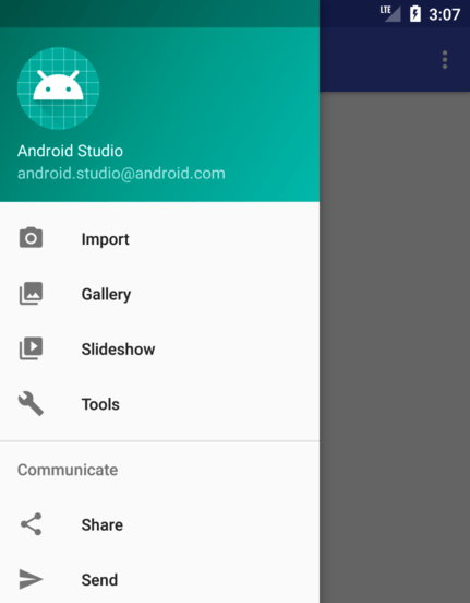
Many Android apps contain some form of menu system. In practice, these are, perhaps as you might have expected by now, also separate views, which slide on top of each other. A classic example of this is the navigation drawer from Google’s Material Design stack. It contains menu items, defined in a menu XML file, and has a header, which can contain anything, from a simple TextView to a more intricate Fragment:

Key mechanics involved:
- Use a
DrawerLayoutin the activity where you want the menu to slide in, instead of a regularConstraintLayout. It should only contain 2 items: an activity/fragment layout and aNavigationViewelement. That is, if you require complex layouting, use aNavigationViewin combination with a singleFrameLayoutcontainer and inject it with whateverConstraintLayoutin your Kotlin code. See the example in the GitHub repository. - Create a separate layout XML file where the drawer header layout resides. For example, as in the above screenshot, it could contain a logo and some text (“Android Studio”,
android.studio@android.com) - Create a separate menu XML file where all menu items, icons, and titles reside.
- Update the activity code to glue it all together.
The navigation drawer component is part of the external androidx.navigation libraries we also used in the fragment navigation chapter: see setting up your environment in the Android Developers Guide.
Layouting
The NavigationView refers to both the menu and the layout XML:
<com.google.android.material.navigation.NavigationView
    android:id="@+id/navView"
    android:layout_width="wrap_content"
    android:layout_height="match_parent"
    app:headerLayout="@layout/nav_header"
    app:menu="@menu/nav_menu"
    android:layout_gravity="start"
    android:fitsSystemWindows="true" />
While the menu, created in directory app/res/menu, is quite simple:
<?xml version="1.0" encoding="utf-8"?>
<menu xmlns:android="http://schemas.android.com/apk/res/android">
    <item
        android:id="@+id/menuPony"
        android:title="My Little Pony" />
</menu>
Don’t forget to create a separate layout file for the navigation header (in the XML above referenced as @layout/nav_header). You can give its background another color by setting android:background to have the menu header stand out. In our example, the layout_height is set to 150dp:
<?xml version="1.0" encoding="utf-8"?>
<androidx.constraintlayout.widget.ConstraintLayout xmlns:android="http://schemas.android.com/apk/res/android"
    android:layout_width="match_parent"
    android:layout_height="150dp"
    android:background="@color/design_default_color_primary">

</androidx.constraintlayout.widget.ConstraintLayout>
Thus, in total, we have altered and/or created three resource files.
Binding
The meat of the work is done though an instance of ActionBarDrawerToggle. This represents the menu icon (a “sandwich”-style icon) on the top right where the user clicks on in order for the menu drawer to slide in. After creating an instance and adding it to the drawer layout, we call syncState(), which does the dirty work for us.
Lastly, and perhaps most importantly: drawer menu item click listeners, bound through the navigation view setNavigationItemSelectedListener. Putting everything together in our main activity’s onCreate():
menuBarToggle = ActionBarDrawerToggle(this, binding.drawerLayout, R.string.menu_open, R.string.menu_close)
binding.drawerLayout.addDrawerListener(menuBarToggle)
menuBarToggle.syncState()

// when the menu drawer opens, the toggle button moves to a "back" button and it will close again.
supportActionBar?.setDisplayHomeAsUpEnabled(true)

binding.navView.setNavigationItemSelectedListener {
    when (it.itemId) {
        R.id.menuPony -> doStuff()
        // ...
    }
    true
}
Note that, in Kotlin, the last statement in closure blocks simply acts as a return value. Hence the perhaps weird true statement, where you’d expect a Java-like return true;. That also works, of course—minus the semicolon. Returning false tells the navigation view that the listener failed to catch the event.
In order for the menu drawer button to change into a “back” button that will close the drawer, we simply call setDisplayHomeAsUpEnabled() and pass in true.
To see it all in action, build examples/kotlin/recyclerviewWithNavDrawer from the course repository. This is an evolution from the earlier example in this chapter, recyclerview.
Lab Exercises
Let’s finally try to recreate that Mail App.
- First, design the single item view. It should show a title, the first x characters of the mail body, and a date on the top right (see screenshot above).
- Next, integrate the above RecyclerView patterns to display the mail list view. Run the app to make sure at least the list view works, before continuing.
- Add an
onClicklistener to each item which navigates to another activity (or fragment using navigation: your choice). The detail view should again display the title and date, but also the authors, and the full mail body. - Again, make sure the above runs fine before continuing. Now extract the
RecyclerViewinto a single fragment using aFrameLayoutand thesupportFragmentManager. See the fragments chapter. Re-run and test again. - Lastly, now that we have extracted a fragment, introducing a navigation drawer is much simpler: replace the constraint layout of the main activity with a
DrawerLayoutand create a menu system with the following items:- “Clear All Mails” (clears the recyclerview list)
- “Reset Mails” (resets the list to the hardcoded values)
- “Sort Mails” (sorts by date, descending)
Just make up hard-coded fake data to test your app, just like we did in the demo TODO app. If you’re done with the above exercise, implement a FloatingActionButton to add a new element to the list as a bonus.
In case you were wondering: to display both the list and the detail layout, typically, a sliding pane layout is used, also called a two-pane layout. If you create a new project in Android Studio and select the “Primary/Detail Flow” template, you’ll see an example of this.